DESIGNING A RESEARCH POSTER
After determining what to include in your poster and who your audience is, the next big step is designing your poster. Whether you have experience developing research posters, or you are creating your first research poster, creating an effective, high-quality poster requires careful planning and attention to detail. We have broken down this process into six major steps to help aid in your design and development process.
To exemplify each of the following, we will walk you through the development of a mock undergraduate research poster - from a sketch to the final version. Follow along with the development of a mock poster through each step.
Getting Started
Step 1: Review Existing Posters
Prior to developing your own poster, it may be helpful to review existing posters to generate ideas. To find existing posters, you may want to
-
Check-in with your Mentor: Mentors often have poster templates you could use or copies of posters other students have created that you can use to develop your own poster.
-
Check out Other Researcher's Posters: You can find many research posters online from various institutions. A few sites that provide online posters include the following:
-
[Begining Spring 2024] Office of Undergraduate Research's Digital Repository at the Univeristy of Maryland (DRUM)
-
Institutional Website Collections:
-
Posters on this website developed by George Hess of North Carolina State University with Kathryn Tonsey and Leon Liegel.
-
Posters in this collection of undergraduate research posters maintained by the University of California-Davis’s Undergraduate Research Center. This collection contains posters representing a wide range of disciplines and approaches to design.
-
-
Step 2: Sketch Out Your Poster
Before diving straight into the poster creation process, it may be helpful to sketch out a layout of your poster. This may help you get an idea of the layout of your poster, where figures and images may go, and how you’d like your poster to look before committing to a specific design.
Step 3: Creating Your Poster
After getting an idea of how you would like your poster to look, you are better prepared to begin to develop your poster using poster creation tools. Google Slides and Microsoft PowerPoint can be used to create posters and are free to UMD students through the university. UMD Students also have access to Adobe Creative Cloud software, such as Adobe Illustrator, which can be a powerful tool for developing posters but may be more difficult to learn if you are a new user.
For the purposes of this guide, we will demonstrate the following guidelines and suggestions using Microsoft PowerPoint . However, OUR has developed several basic poster templates compatible with Microsoft PowerPoint and Google Slides.
PowerPoint Templates (PPTX files)
-
Landscape: Blank or With Banner
-
Portrait: Blank or With Banner
Poster Basics
After choosing your Poster Creation Tool, ensure you consider the following as you develop the initial draft of your poster.
-
Check the Size of Your Poster: This is a critically important first step to make sure your poster is formatted and printed correctly. To determine the size of your poster, check for poster dimension requirements of the poster session in which you are presenting. For most OUR Poster Sessions, your poster should be 48” by 36” (Landscape Layout) or 36” by 48” (Portrait Layout).
-
Changing Poster Sizes: Each Poster Creation Tool has different methods for changing the size of a poster. In Microsoft PowerPoint, you can change the size of your poster by selecting “Design,” “Slide Size,” “Page Setup,” and entering the correct dimensions for your poster.
-
Adding Headers, Text, and Visuals to Your Poster: After you ensure your poster is the correct size, you can begin to enter headings and text where you feel it is most appropriate. The most common poster headers are Introduction, Methods, Results, and Discussion.
You may want to pull information from the brainstorming you did related to developing your Research Story and considering your Audience. Your text doesn’t need to be perfect for now. It is more of a placeholder to give you an idea of where each of your sections might go.
-
Add Logos and Branding: It is important to make sure you are using the University of Maryland and your Department’s Logo correctly. The Office of Marketing and Communications has a webpage dedicated to the proper use of UMD logos. Ensure you are following the guidance shared on their website when adding a UMD logo to your poster.
-
You can find and download your specific College or School’s logo at brandportal.umd.edu.
-
Bonus Tip: If you have access to one, use a logo with a transparent background. This will allow the UMD logo to integrate more seamlessly with your poster design.
-
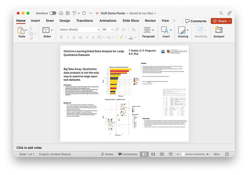
We now have all the basic information we need added to our poster. We will now move to customizing the design and aesthetics of our poster.
Poster Design & Aesthetics
Next, we will consider some basic graphic design and user design principles and apply them to develop our poster into a more visually appealing display of our research.
Graphic Design Principles
Background Color: Choose a background color for your poster. Most often, light colors work best for posters, with white being the most common background color for a poster. This is because posters with white backgrounds
-
Allow for high contrast between text and the background,
-
Are easy to use with other accent colors, and
-
Are often easier and cheaper to print!
Establish Visual Hierarchies: In your poster, it is important to differentiate each section of your poster. You can easily do this by developing visual hierarchy cues. A few ways to do this are:
-
Increasing font size and bold header text
-
Adding blocks, lines, or shapes around your headers
-
Create boxes for your body text.
Font Types & Sizes: Font is so important! Choosing a font that is legible up close and from a distance is critical. For the most optimal use of font, two factors should be considered:
-
Sans Serif Fonts are fonts without (sans) the “embellishments.” Sans Serif Fonts are generally easier to read at a distance and are often the preferred font for use on posters.

-
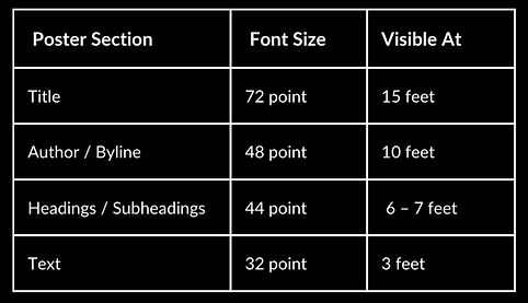
Font Size: Consider that the average distance between your audience member and your poster when an audience member is walking by your poster could be anywhere from 10-14 feet, while the distance between you and your audience when presenting your poster could be 4-6 feet. Keeping this in mind, consider the following Legibility Guide and Size Suggestions to adjust your poster’s fonts.
Alignment and Spacing: Alignment and spacing are important for enhancing readability and visual appeal. Proper alignment ensures that content is organized in a coherent and structured manner, guiding the viewer's eyes smoothly across the poster. Adequate spacing between elements allows for clear differentiation between sections, preventing overcrowding and making information easier to digest.
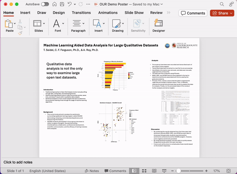
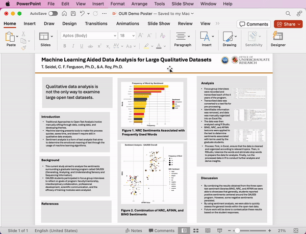
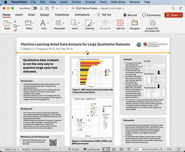
In our example poster, we have increased the font sizes to be consistent with the recommended font sizes. See how alignment is checked in Microsoft PowerPoint below.
Choosing a Color Scheme
When designing your poster, consider selecting and utilizing a limited but cohesive color palette. While the UMD colors are always an option, alternative color palettes can make your poster stand out. Websites like coolors.co and color-hex.com may help you identify alternative color palettes. After you select your color palette, utilize hex or RGB codes to maintain consistency in colors throughout the poster.
In the example poster, we changed a few of the smaller components to follow the UMD color scheme used in the barchart, but note that additional changes could be made to make the poster even more colorful.
Accessibility
When choosing colors, it is important to select accessible colors and fonts. To ensure your poster meets color-blind accessibility criteria, you can use online tools to ensure accessibility and distinguishability. This is particularly important when color is the primary differentiator in visual aids like charts or figures.
You may also want to consider the level of contrast between your text and your background color. To check this, you can use contrast checks WebAIM's Contrast Checker.